Jerome healy
jeromehealy@gmail.com
Tools used: After Effects, Photoshop, Rhino, Keyshot, Illustrator, XD
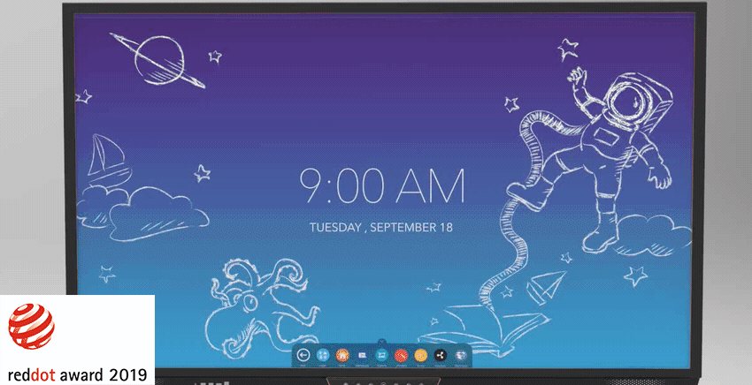
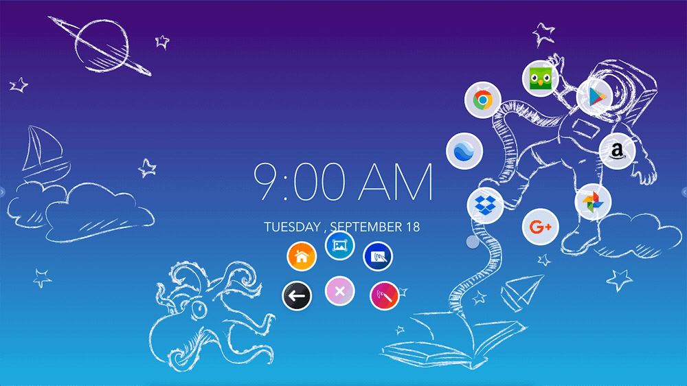
Promethean ActivPanel 7
The Red Dot Design Award winning ActivPanel provides an immersive, tablet-like experience at the front of the classroom and delivers a natural writing experience for teachers and students so they can collaborate with ease.
Too Long Didn’t Read (TLDR):
-UI related support calls dropped by 50%
-Yearly projected profits were exceeded by 5% with the new design direction playing ‘a significant role’ at point of sale
-Panel interaction went from a high of 1.5 million interactions per month to 3 million
-1 Red Dot Award
Role
Lead UX Designer
Problem
In education there are no edge cases. Accessibility isn’t a trending design concept, but a fundamental right for every student and teacher. Our challenge was to create hardware and software experiences that integrate seamlessly, are accessible to all abilities, and deliver on their original intent to further the learning experience of every student.
Journey
Creating Design Standards
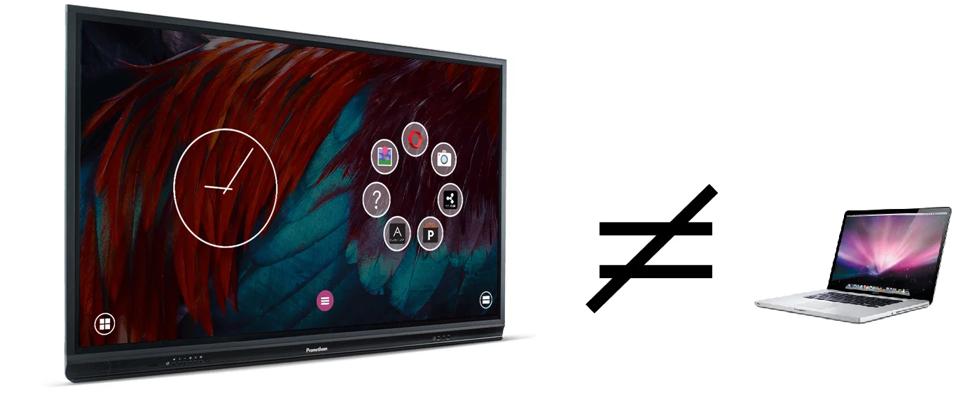
In the summer of 2018 I was tasked to redesign Promethean’s ActivPanel 6 (AP6) and this re-design would carry into the AP7’s slated for 2019. From the beginning it was clear that the UI for these panels was designed first on a desktop computer and then transferred onto the panels at the end of the process. This led to users having to physically reach across the panel long distances, and walking back and forth to navigate the panels. In short, our starting space was to design for a large panel experience, not a desktop experience.
Tools used: Photoshop, Illustrator
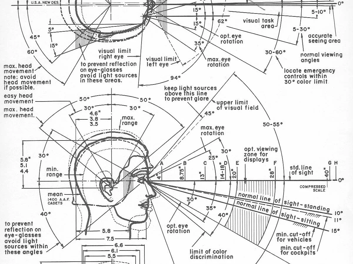
Henry Dreyfuss
Henry Dreyfuss was an Industrial Design pioneer. He wrote the book, “The Measure of Man and Woman: Human Factors in Design” where he took average measurements of the average American in the 1950’s. I leveraged his findings and created design standards when designing for the panel. This informed how we would make any UI decisions moving forward.
Design Standards For The Panel
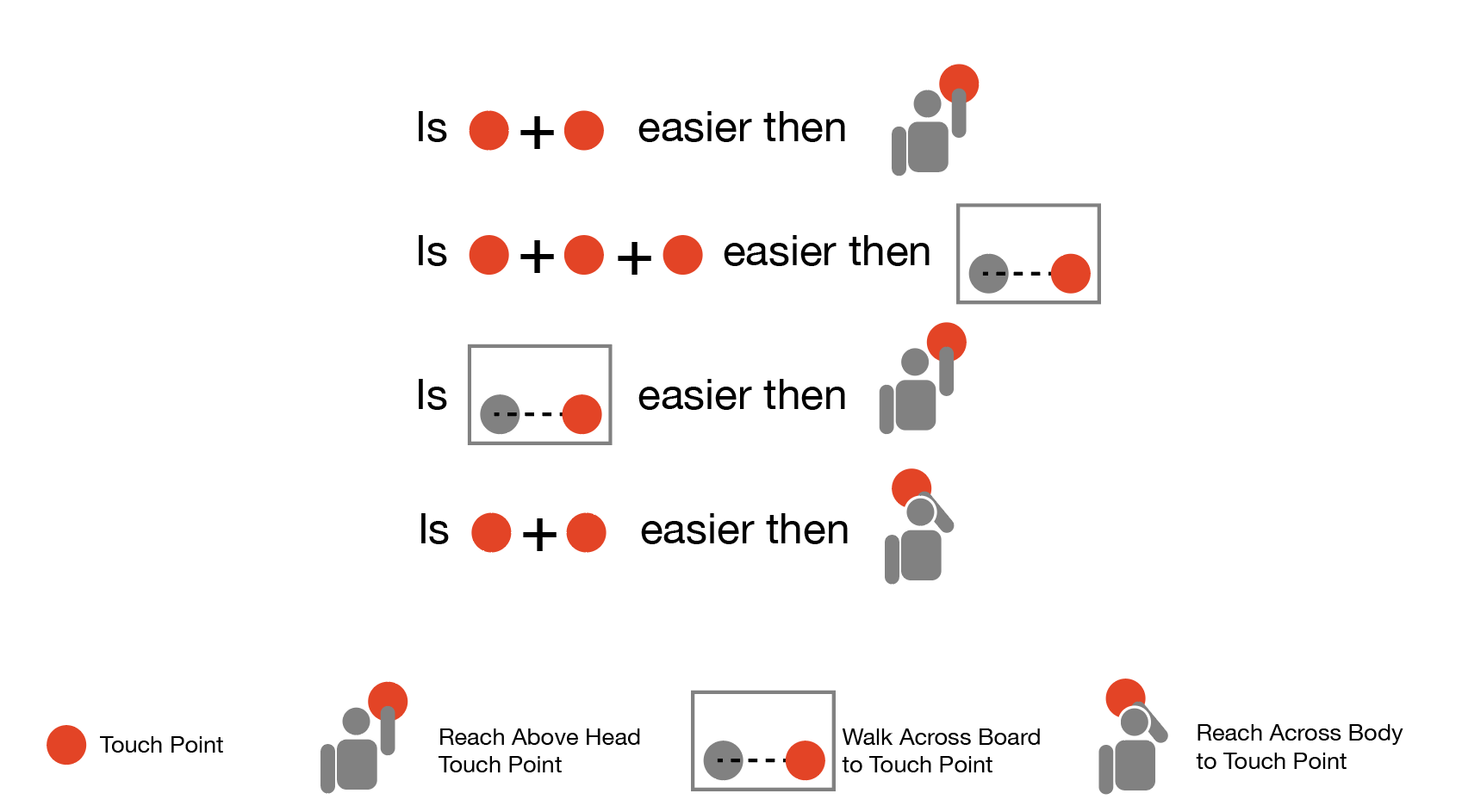
Clicks
There is much emphasis on reducing clicks in UX, but for the panel it was not so simple. I created this reference chart to help our designers determine how to create UI’s. It was intended to get them thinking about button placement and the impact it would have on different users.
Tools used: Illustrator
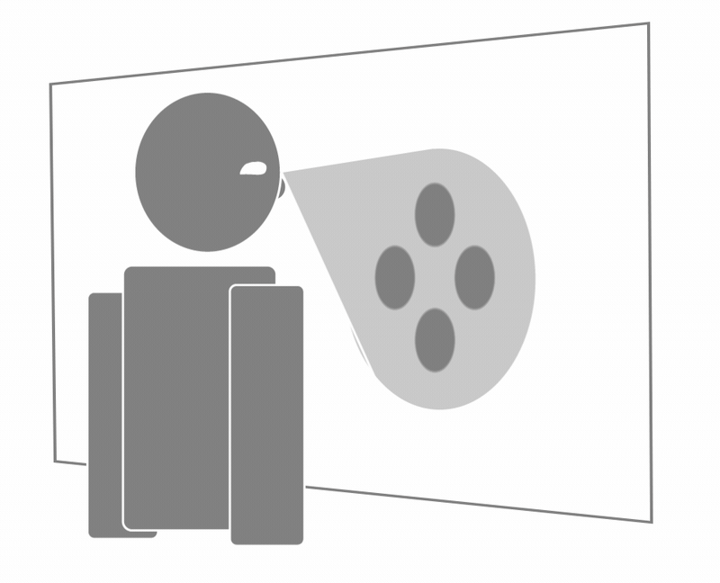
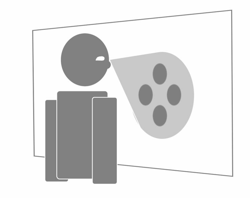
The Cone Of Vision
Users could only see portions of the panel when they were standing in front of it. I called this portion the ‘cone of vision.’ All of our UI’s should fall in this cone of vision and if something was outside of it, the user should be able to track it. It was easy to quantify a successful usability test if the user was breaking the cone of vision to see content. Many users would do the ‘step back’ or the ‘lean’ to see content fully. This was a fail and the UI had to be refactored.

Not All Cones Are The Same
It was soon apparent that some users were kindergartners and others were basketball coaches. Below is a chart created by Connie Lin, our visual designer illustrating the extremes of our user groups.

Determining The Users Cone Of Vision
Connie also discovered there was a formula for each users cone of vision based on their reach. This would allow us to create custom experiences that worked best for each users height and reach.

Help The User Focus… By Blurring
Many users got lost at the panel and scanned with their heads rotating 180 degrees to find content that a lot of times was right in front of them. Another design guideline was to blur non relevant content so the user could find relevant content faster.
Tools used: After Effects
Reachability
There needed to always be a way for the user to access content at the top of the page if they couldn’t physically reach it.
Tools used: After Effects
Objects Exiting The Cone Of Vision
If content was exiting the cone of vision it should never “pop” outside. Instead, it needed to smoothly exit so the eye can track it. Below (left) illustrates how items should exit the cone, while the opposite (right) animation breaks the guideline.
Tools used: After Effects, Illustrator
Initial Approach
Armed with my Henry Dreyfuss’ design findings I presented to the product team and got buy-in on designing for the user standing in front of the physical panel, NOT designing as if it were a desktop. In the early stages of the process I was tasked to update the existing UI. There were several immediate issues with the UI, such as: apps were scattered in multiple locations and it wasn’t easy to find the apps you needed as a user; there were three separate UI settings for the user to choose from - for example you could have one setting with a volume at maximum, and another setting with a volume turned off.
Tools used: Illustrator
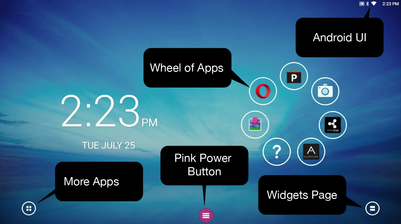
Shown here are all the areas to find apps (above) and the expanded Pink Power Button PPB (below).
Information Architecture
It was clear from early usability testing that people were very confused as to where things were, how they got there, and how they could organize items. The first approach to preserve the Pink Power Button (PPB) was to turn it into a tools box of sorts. With the large form factor of the panel, the thinking was maybe it would follow the user around and they could access all the panel had to offer after one tap.

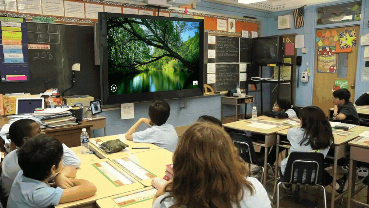
Card sorting and sketching around redesigning the PPB

Tools used: After Effects, XD
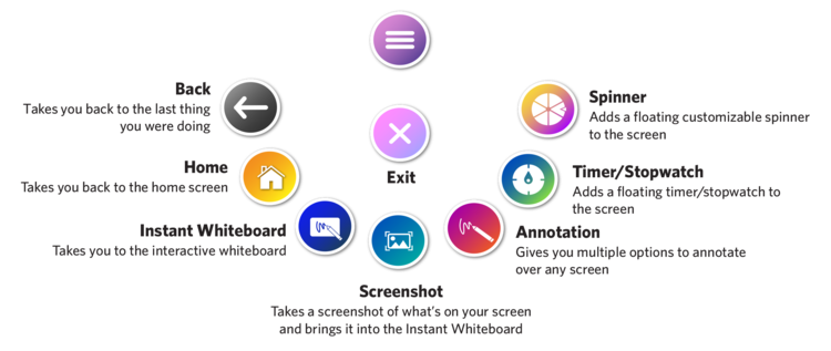
Early redesigns of the PPB
Tools used: After Effects, Photoshop, Rhino, Keyshot
Exploration around how the UI could interact with the hardware

Early Usability Testing
The early testing had some promising results. It was much easier for users to find what they were looking for. They accomplished tasks with much greater speed and reported a lot more confidence at the panel. There were however, many workflows that broke-down quickly once they got a few levels deep. For example file navigation, moving files, drilling into settings etc.
Pivot
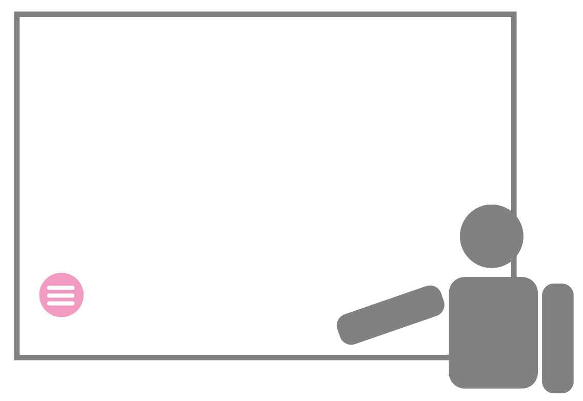
A lot of excellent insights and findings were gathered from the attempt to redesign the PPB. In the end our users were running into some of the same persistent problems. Two main problems were 1) the PPB got lost often (see below left) and 2) if the user forgot to drag it around with them, they were always going back to get it (see below right).

Tools used: Photoshop
3 for 1
One of the big shifts in thinking came when it was discovered that UI needed to be provided for the users physical location at the panel, not UI for the whole panel. In other words if the UI is designed for the user standing in front of the panel then there should be redundancies because the scale of the panel makes it as if there are three smaller devices pressed together.

Tools used: Illustrator
With this idea of designing for the physical user vs the device the decision was made to have the location of the main controls in three static positions. This way the user always knows where the controls are, will never accidentally lose the menu, and the user can build muscle memory based on where they are standing at the panel.
Transitioning Current Users To The New Design
One of the challenges of updating the UI was we have over 1 million panels in the world with the old UI. There are countless training videos, documentations, tutorials, and websites supporting the old UI. So we had to have a plan in place for this transition that didn’t require training and didn’t disrupt classrooms. The first step was to allow the user to opt in. This decision was usually made by the schools IT Director who knew the consequences of this change and could support the teachers in the transition. Once the update was delivered we needed a quick, but informative way to educate the user. To accomplish this I created a simple animated tutorial that the teacher could walk through. Here I showed that we didn’t add or take away things that needed to be learned, but we simply moved the tools to different places. This tested extremely well and is illustrated below.
Tools used: After Effects, XD
How To Measure Success
In the usability tests huge improvements had been made. The iterations showed users went from completely failing to accomplishing tasks.
While doing competitive analysis I saw that users of other panels were reaching all over the panels. Even with competitors that had better UI than we currently had, their users were still physically walking, stretching and stepping back to accomplish tasks. I began filming users doing the same tasks with different users and it became clear that a great experience at the panel required a small ‘reach signature.’ Below are studies I conducted tracking teachers hand movements at the panel and the distance their hands had to travel to accomplish tasks. NOTE: The below videos are shown with the users permission.
The above video is particularly interesting because the keyboard was out of this teachers ‘cone of vision’ and it took a while to spot. The below video is a prototype along the way. Notice the much smaller reach signature.
Below the reach signatures overlap and the contrast is stark. Keep in mind those lines are covering feet of distance.
The reach signature and natural experiments
One of the interesting findings that came about when trying to determine an appropriate size for the reach signature was that the signature revealed itself in everyday places. The wear and tear of everyday objects told us where people liked to reach. Below are some examples of natural wear marks that gave us a lot of info about how people reach.

We also observed where people felt comfortable writing.
The (un)Finished Product
In the first year we were not able to reflect all of our research in the final product. We continue to implement our findings with every build as well as incorporate changes that the telemetry reveals.

The Impact
The following are quantifiable standards we created for ourselves as well as a reflection of the business goals we achieved. We measured our reach signature against the competition as a baseline. These measurements consisted of: time it took to complete the task and distance traveled by arm and reaches into the ‘red-zone.’ We hope in the builds to come to hit our own benchmarks.


